


Step into the dissonance with Lost Inside—a bold, experimental display font engineered to disrupt, unsettle, and command attention. This isn’t a serif. It’s not a sans. This is visual emotion in font form. Every letter bends, leans, and distorts—like thoughts fracturing under pressure, like silence before a scream. The letterforms are deliberately unstable, their structure challenged, their rhythm interrupted. The result? A visual pulse of inner noise that pulls viewers into a space of tension, unease, and raw authenticity.
Lost Inside defies tradition. It does not follow a standard uppercase/lowercase hierarchy. Instead, it unfolds through two alternate character sets—a dynamic duo of distorted glyphs that can be freely mixed and matched. This allows you to craft unique visual rhythms, shift textures on the fly, and control the balance between chaos and structure. Switching between sets becomes an act of creative experimentation, not just typographic selection. You’re not choosing letters—you’re sculpting mood.
Designed for Impact, Not Comfort
This font doesn’t aim to be legible. It aims to resonate. It speaks through distortion, not clarity. Lost Inside thrives in strong, short statements—headlines, punchy quotes, poster slogans, and abstract compositions where atmosphere is everything.
1. Art Posters & Zines: Where Emotion Takes Form
Infuse your experimental prints and self-published zines with psychological depth. Use Lost Inside to mirror anxiety, longing, or surreal introspection. It transforms a sentence into a feeling—making your art speak in whispers of unease and silent rebellion.
2. Music Covers & Band Branding: The Sound of Dissonance
For underground bands, noise artists, or experimental musicians, this font is a sonic mirror. It gives your album cover a raw, authentic edge—perfect for genres that value emotion over polish. Let your visual identity scream the chaos your music already carries.
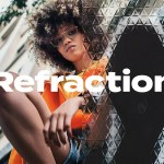
3. Fashion Editorials: Challenge Conventions
Use Lost Inside in avant-garde fashion shoots to add a layer of psychological tension. It’s ideal for editorial spreads that explore identity, imbalance, or modern alienation—where the typography becomes part of the narrative, not just an afterthought.
4. Conceptual Branding & Identity Projects
Brand identities that want to stand out in the noise—brands that reject perfection—can use this font as a signature voice. It signals courage, introspection, and a willingness to be felt, not just seen.
5. Contemporary Collage & Mixed Media
Layer Lost Inside over textured backgrounds, grainy photos, or scribbled sketches. Its irregularity cuts through digital uniformity and becomes a visual anchor in chaotic compositions. It turns a collage from a visual mix to an emotional experience.
Powerful Features for Creative Control
Despite its radical appearance, Lost Inside is built with purpose and precision. It offers:
- Two interchangeable character sets – Mix, match, and balance distortion at will.
- Complete uppercase and lowercase support – Full access to both sets for maximum creative flexibility.
- Numbers and punctuation – Maintain typographic consistency even in disruptive contexts.
- Multilingual support – Works with European Latin-based scripts, expanding its expressive reach.
When to Use It—and When Not To
Use Lost Inside when: You want to convey emotional instability, inner conflict, or artistic rebellion. It’s perfect for standalone visuals, bold statements, and experimental projects.
Avoid it when: You need clarity, formal structure, or wide readability. It’s not for body text, signage, or corporate branding.
High-Impact Licensing: Create Without Limits
Use Lost Inside freely in any commercial or creative project without restrictions:
- Branding and logos (identity systems)
- Print and digital advertising
- Album art, music videos, and band visuals
- Art installations, posters, and exhibition designs
- Web and app UIs (when used stylistically)
- Agency work and client deliverables
No attribution needed. No hidden fees. Just pure, controlled dissonance.
Download Lost Inside Today—Let Your Design Embrace the Unstable
Lost Inside isn’t about perfection. It’s about presence. It’s about the moment when a typeface doesn’t just communicate text—it makes you feel something.
Stop aiming for balance. Start embracing chaos. Download Lost Inside now and let your work speak from the edge.


