


Built from an obsessive love for old print textures and imperfect ink, Carnivels Lights was never meant to be clean. It was crafted to feel touched, shaped, and slightly unruly—like a document pulled from a forgotten archive. This is no sterile, modern serif. This is a typeface with raw stroke energy and rounded editorial curves, carefully tuned to balance power and elegance.
Every serif, every stroke, every subtle irregularity was hand-adjusted to create a sense of authentic presence. It doesn’t shout—because it doesn’t need to. It holds space with quiet confidence. It’s the visual equivalent of a well-worn book, a vintage poster, a timeless brand logo—something that feels like it belongs, not just exists.
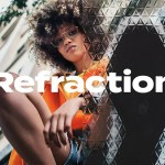
Engineered for Impact: Designed for Headlines That Demand Attention
Carnivels Lights was built for large-scale expression. It thrives in bold titles, heritage-inspired branding, fashion editorials, packaging, posters, and statement logos. When used at size, its texture becomes a character in itself—each letter feels hand-placed, deliberate, and alive.
- Headlines & Titles: Dominates without overwhelming. Ideal for magazine covers, digital banners, and editorial layouts.
- Heritage Branding: Gives legacy brands, artisanal labels, and vintage-inspired lines a sense of history and credibility.
- Fashion & Editorial Design: Adds drama and depth to runway lookbooks, fashion spreads, and luxury product campaigns.
- Packaging & Posters: Creates instant visual gravitas. Perfect for limited editions, event promotions, and museum exhibitions.
Let it breathe. Carnivels Lights isn’t designed to be crammed into a small space. Give it room. Let the texture speak. That’s where its power lies.
Power Meets Precision: 365+ Glyphs, Full Multilingual Support
Beyond its aesthetic strength, Carnivels Lights is a functional powerhouse. With over 365 glyphs, including comprehensive symbol sets and extended character support, it’s ready for any project—local, regional, or global.
Features That Work in the Real World:
- Uppercase & Lowercase Letters: Full alphabetic coverage for all text types.
- Numerics & Punctuation: Accurate spacing and form for clear data presentation.
- Extended Multilingual Support: Works with European languages including English, French, German, Spanish, Italian, Dutch, Portuguese, Swedish, and more—complete with diacritical marks (e.g., é, ñ, ç, ö).
- Special Characters & Symbols: Includes ligatures, fractions, and decorative elements for high-end design use.
Seamless Use Across Design Workflows
Designed to integrate effortlessly into your daily workflow, Carnivels Lights is delivered in industry-standard formats:
- .OTF (OpenType Font) – Optimal for professional design software and print.
- .TTF (TrueType Font) – High compatibility with web and operating systems.
It works flawlessly with:
- Adobe Creative Suite (Illustrator, Photoshop, InDesign)
- Figma, Sketch, Canva, Affinity Designer
- Web development (via CSS @font-face integration)
With perfect kerning, consistent spacing, and scalable vector quality, your typography remains sharp and professional—no matter the output.
More Than a Font: A Design Philosophy
Carnivels Lights isn’t just a typeface—it’s a statement of intent. It’s for designers who reject the cold precision of digital uniformity. It’s for those who believe typography should feel emotional, textured, and human.
It’s for creatives who know that in a sea of sameness, imperfection is power. That a slightly uneven stroke, a subtle ink bleed, a hand-tuned curve—these aren’t flaws. They’re soul.
When you use Carnivels Lights, you’re not just choosing a font. You’re choosing to stand out—not by shouting, but by being unforgettable.
Claim Your Bold Identity: Download Carnivels Lights Today
Ready to redefine what bold typography can be? Download Carnivels Lights now and bring expressive confidence, vintage soul, and undeniable presence to your next big project.
Let your design speak with character. Let it feel alive.


