

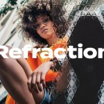

Haute Lettre channels couture sensibility and editorial precision into a refined serif that commands attention. Designed for high-fashion identities, premium packaging, and sophisticated editorial layouts, this typeface balances graceful contrast with purposeful structure. Haute Lettre elevates visual systems and instantly conveys premium quality and timeless style.
Design Characteristics
Refined Letterforms
Haute Lettre features sculpted serifs, controlled stroke contrast, and clean terminals that read clearly at display sizes. Each character emphasizes vertical rhythm and elegant proportion, giving headlines and logotypes a polished couture presence. The design prioritizes legibility while retaining a distinctive high-fashion voice.
Editorial Influence
Inspired by classic magazine typography, Haute Lettre adopts editorial spacing and optical balance to perform seamlessly in long-form layouts and striking covers alike. The typeface adapts to large-format headlines and compact captions with consistent clarity, making it ideal for lookbooks, magazines, and brand manuals.
Versatile Contrast
Haute Lettre delivers enough contrast to feel luxurious without sacrificing readability. Use heavier weights to create bold, authoritative headlines; choose lighter weights for refined supporting text. The resulting hierarchy reinforces a premium aesthetic across print and digital touchpoints.
Primary Applications
Haute Lettre performs best where elegance must translate into a memorable brand impression. Typical use cases include:
- Luxury branding — craft distinctive logotypes, wordmarks, and identity systems that communicate exclusivity.
- Premium packaging — apply refined headings and captions to elevate fragrances, cosmetics, and couture product lines.
- Editorial design — design covers, features, and mastheads that demand a sophisticated typographic voice.
- Collateral and stationery — create invitations, business cards, and letterheads that embody refinement and attention to detail.
- Digital branding — use prominent display styles on websites and social campaigns to maintain a high-end presence online.
Pairing & Usage Recommendations
Complementary Typefaces
Pair Haute Lettre with a neutral sans-serif for body copy to create clean contrast and preserve legibility. A humanist or geometric sans offers modern balance that keeps layouts contemporary. For a more classic look, pair with a soft, low-contrast serif for secondary headings.
Hierarchy and Styling
Reserve Haute Lettre for primary headlines, logotypes, and short editorial phrases. Avoid setting long paragraphs in display weights; instead, use the typeface to establish hierarchy and character. Adjust tracking subtly in large headlines to emphasize luxury spacing, and increase letterspacing for monogram treatments.
Language Support
Haute Lettre includes the essential Latin glyph set suitable for international branding and standard editorial needs:
- Basic Latin: A–Z, a–z
- Numbers: 0–9
- Punctuation and common symbols
Technical Details & Licensing
The font package supplies production-ready formats and straightforward licensing terms. Confirm license scope before embedding the typeface in commercial products, apps, or client deliverables. Typical inclusions:
- OTF/TTF desktop files for design and print work
- Webfont formats for online deployment (where applicable)
- Basic usage guidance and recommended sizes for display work
Production & Finishing
Haute Lettre responds beautifully to premium print finishes. Consider foil stamping, embossing, letterpress, or subtle varnish to enhance the typeface’s refined strokes. For digital applications, use high-resolution rendering and maintain generous contrast against background colors to preserve its couture appearance.


