

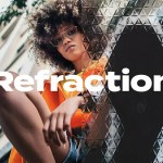

Sunland channels the relaxed confidence of 1960s Californian design into a bold, usable display typeface. Inspired by sun‑faded signage and clean modern forms, Sunland gives your headlines and logos a nostalgic yet forward‑looking attitude. The family balances character and clarity so you can create striking identities and readable promotional materials without compromise.
Design Character
Sun‑Faded Signage Aesthetic
Sunland replicates the gentle wear and warmth of painted signs exposed to sunlight. Letterforms carry subtle irregularities and organic curves that read authentic at display sizes, while preserving consistent shapes that avoid visual clutter. The result reads as deliberately weathered rather than accidental — a crafted vintage look that still feels intentional and modern.
Clean, Forward‑Looking Forms
Underneath the nostalgic surface, Sunland keeps proportions clean and open. The counters and spacing support legibility at medium and large sizes. This clarity makes the font versatile: it asserts personality in a logo, anchors a poster, and remains readable across packaging or social graphics.
Expressive Alternates
Sunland includes experimental alternates and stylistic glyphs that transform ordinary words into statement marks. Use alternates to emphasize brand initials, create unique logotypes, or add retro flair to headlines. Designers can toggle alternates to move the design from understated to expressive within seconds.
Primary Applications
Sunland performs strongly wherever a confident visual identity matters:
- Branding and wordmarks — build recognizable, characterful logos that feel handcrafted.
- Posters and editorial covers — create bold headlines with instant period mood.
- Packaging — lend products a warm, tactile personality that suggests heritage.
- Social media visuals — craft striking feed graphics and story templates with minimal effort.
- Signage and environmental graphics — convey mid‑century charm at scale.
What’s Included
- Sunland.otf — primary display font with standard character set and punctuation.
- Bohemian Extras — vector and PNG shapes & symbols that complement Sunland’s aesthetic (ornaments, badges, decorative elements).
Usage Recommendations
Create Hierarchy with Weight and Scale
Use large sizes and tight tracking for logotypes and poster headlines to maximize the typeface’s sculptural qualities. For subheads or smaller applications, increase tracking slightly to preserve legibility and avoid crowding the decorative features.
Combine Thoughtfully
Pair Sunland with a neutral sans when you need contrast and modern balance. A geometric or humanist sans will support the display personality without competing. For more nostalgic systems, combine Sunland with a subdued serif or a minimal handwritten script to reinforce craft-forward storytelling.
Leverage Alternates Sparingly
Alternates amplify personality, so deploy them for focal elements — logos, initials, or key promotional lines. Avoid using alternates for dense copy; they work best as accent features that draw the eye.
Technical Details
Files include OTF formats suitable for desktop and production workflows. Bohemian Extras arrive as vector (SVG/AI‑ready) and PNG assets for rapid use in web and social templates. Confirm licensing for commercial use, embedding in products, or distribution within client deliverables.


